This brief is to respond to an artist exhibiting in the exhibition, I chose Takahiro Iwasaki Out of Disorder – Clothes, Acrylic Cases, 2017
My response to Iwasaki’s work is based on his use of everyday objects to render an impression or sculpture of a scene or object affected by catastrophe such as the disaster in Hiroshima that changed its landscape for ever. Iwasaki was inspired by Otomo’s Manga comic, Akira. The comic’s Cyberpunk genre was known for its depiction of an oppressive post-apocalyptic version of Tokyo.
As a child Iwasaki used household objects to create robots and toys from materials he found discarded in his environment, he drew inspiration from artifacts housed in The Hiroshima Peace Memorial Museum. Iwasaki uses hair, towels, thread, duct tape, dust and other mundane items. This appealed to me as a truth to materials that creates an opportunity for the artwork to be more than just a representation.
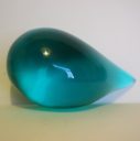
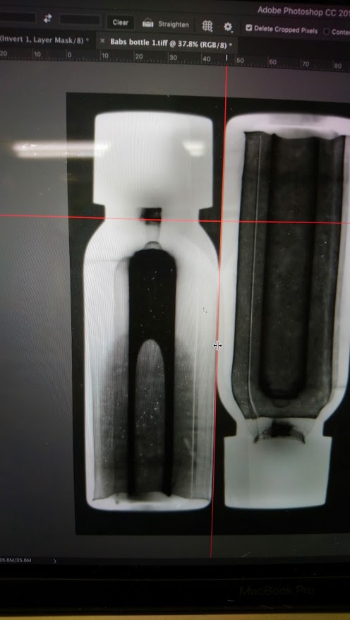
The small bottle of flood water that I had collected from a recent trip to Venice was photographed with a Photogram using .5 of a second of light to leave an impression on the paper. A fraction of time can create an image reminding us that a small change in sea levels can have a devastating impact on the world and particularly the beautiful city of Venice. Water and plastic (an everyday material) created the image which I reproduced in the form of a screen print. I chose the bright dayglow orange to represent a warning and contrast with traditional renaissance style. The cathedral like image formed by the water in the bottle reminded me of the city’s priceless architecture and everything that is at stake in this moment in Venice.
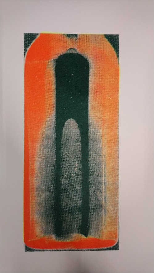
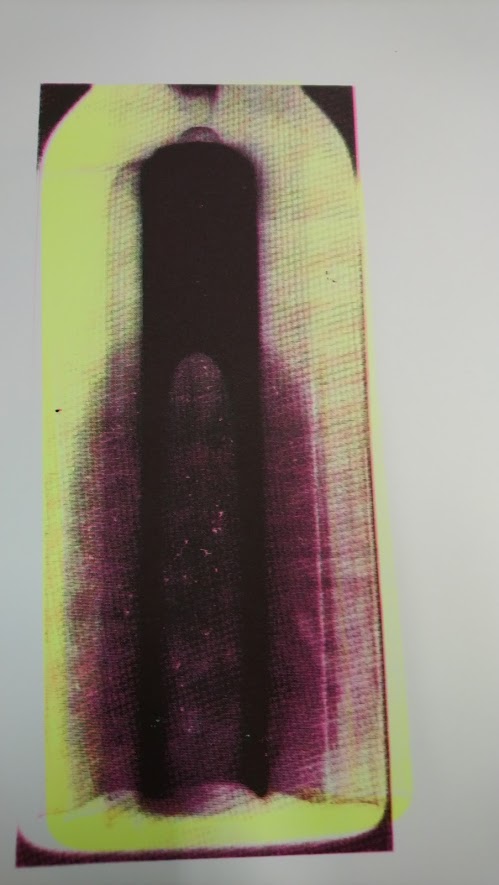
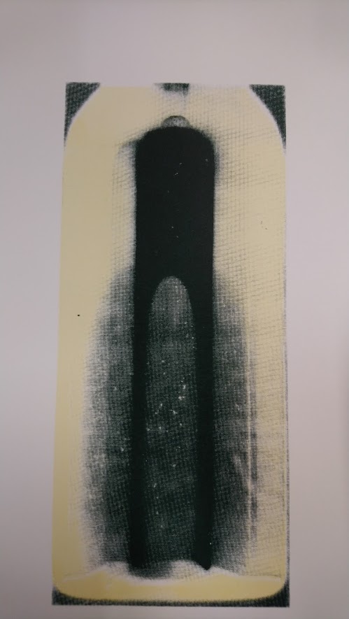
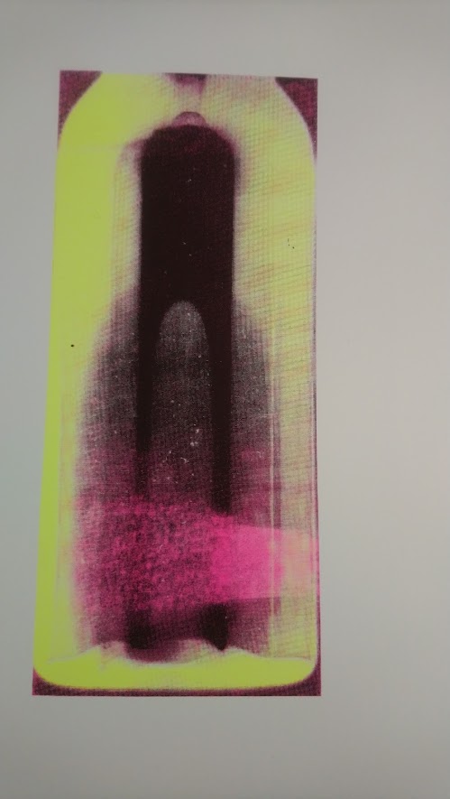
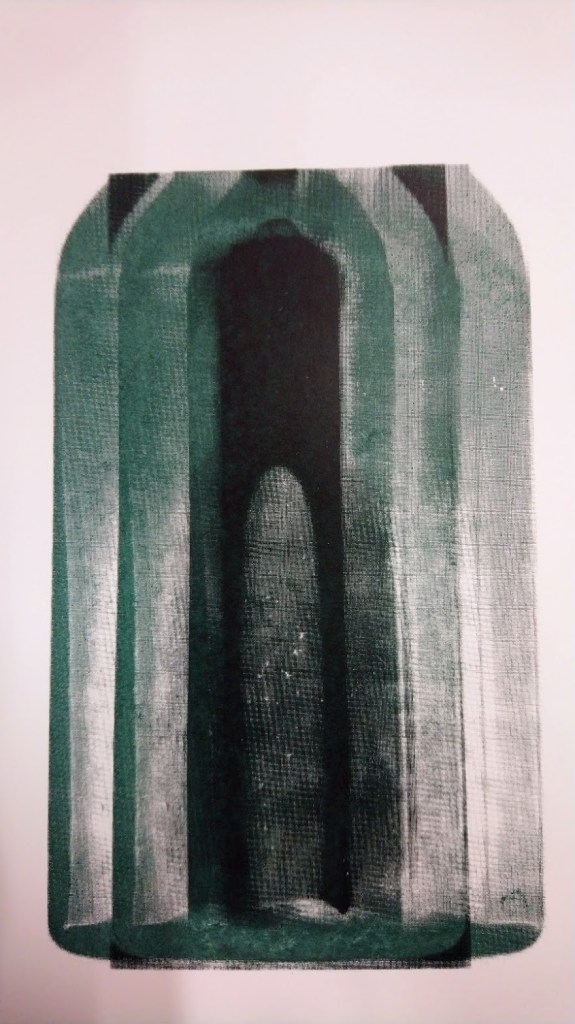
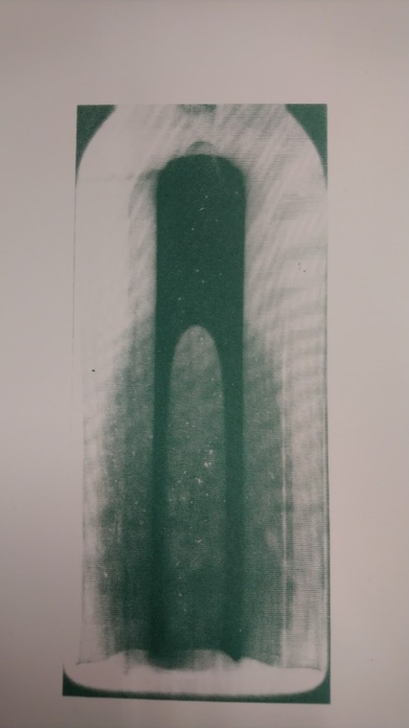
Work on this print produced many different copies each with its own meaning. The repetition of the shape was reminiscent of the arches and domes of he architecture of Venice and the black/dark green acrylic created a feeling of sadness at the loss of this. The layers of luminous paint created a feeling of alert and danger. I used red over the black to emphasise this. The harder I pushed the paint through the silk screen the denser the image became. The less dense ones showed clearly the shadows and edges of the bottle.
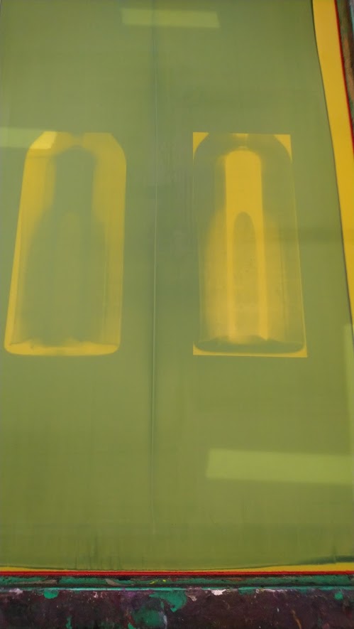
It was interesting to try a 100 mesh screen as it seemed to collect finer detail but also created a wave of lines from the photogram that I did not anticipate. This created a different texture and feel to the print and one that I personally liked. However the bright orange of the one that I chose for the exhibition is a call to action to address the issues of rising sea levels and the loss of priceless architecture and art in Venice.
